The Four Holy Gospels
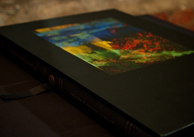
The Four Holy Gospels is an exquisitely designed and produced edition of the four canonical Gospels in the English Standard Version, published in commemoration of the 400th anniversary of the King James Version (KJV) Bible in 1611. The book contains five primary frontispieces (depicted here) as well as hundreds of hand-illuminated pages of scripture.
The Four Holy Gospels features newly commissioned original paintings representing the four Gospel Evangelists, illuminated initial letters, and other embellishments and design elements, printed in full color throughout and on high-quality art paper. The text of the Gospels is reproduced in a highly readable, large font; ideally suited for public reading, liturgical use, and as a family heirloom. The Four Holy Gospels original art and books will be on display as an inaugural exhibition at the Museum of the Bible in Washington DC, which opened on November 17, 2017.
The artist commissioned for the project is Makoto Fujimura, a devout Christian, and one of the most highly-regarded artists of the twenty-first century. He is the founder of the International Arts Movement and has served on the National Council for the Arts. His art is on display at the Museum of Contemporary Art in Tokyo, as well as a number of art museums in the US. A premiere exhibition of the art created for The Four Holy Gospels is planned for December of 2010, at the Dillon Gallery in New York City.
The Four Holy Gospels stands in the historic stream of the beautifully hand-illuminated editions of the Gospels created many centuries ago. This exquisite and unique modern edition carries on a classic tradition, beautifully combining the words of the Gospels and original art, inspired by the text, and brilliantly executed for the glory of God.
From the Artist
Materials Used
In the Nihonga technique I utilize minerals, gold, and sumi ink (all water-based pigments), which are then mixed with Japanese hide glue, and layered over many times on paper or silk. I used materials that I have been saving, or new minerals sent by Nihonga shops in Tokyo. For the frontispieces to Matthew, Mark and Luke, I used a traditional paper no longer commonly made in large sizes. Subsequently, for the Rouault exhibit (because I wanted these works to be as large as 80x64”), I used high-quality handwoven Belgian linen and developed my own gesso (the foundation to build layers of minerals upon) to allow my Nihonga technique to be used.
I am often asked about the process of working on the embellishments and chapter heading initial letters. The embellishments were done last, after a lengthy process of preparing the text and the initial letters onto a high quality watercolor paper.
Spiritual Preparation
I came into the studio each day and read a chapter I was working on, starting from Matthew. It was a privilege to be able to spend so much time, praying and meditating on each chapter, and then thinking of generative ways to create imagery. Having the overall theme of “Jesus wept” in mind, while paying close attention to the content of the chapters, I first selected a particular focus of each. One could do thousands of images for each chapter, so it was important to select an emphasis or area of interest.
For example, in Luke 6, I was interested in the passage of the disciples going through the grain fields. A debate between Jesus and the Pharisees breaks out over the disciples’ small acts of transgression: picking the heads of the grains, rubbing them on their hands and eating them. The Pharisees considered this mischievous and child-like act on the Sabbath unlawful. I painted a big “O” brown earth color on top of Japanese vermillion, and dotted the circle with gold, like grains. I wanted the playfulness to be imbued in the image, but also with an ominous, dark horizon. What seems like a minor argument is only a beginning of a greater tension between the religious authorities and Jesus’ “fulfillment of the law” by grace.
Letter Repetition
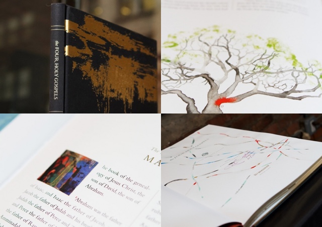
I found that many chapters began with “T” or “A”. Matthew 1, for instance, has a “T” with Christ’s genealogy written in gold. If there are repeating letters, as in Matthew 17 and 18, I tried to make the letters as diverse as possible. In some cases where the content dictated (e.g. Luke 17 and 18), I intentionally designed the two “A” images to echo each other in similar colors, both to speak of the impending suffering of Jesus but one with a darker shadow.
In some of the chapters, I have designed alternative letters. So overall, I ended up doing over a hundred letters.
Abstraction
Some of the letters are very abstract, and I asked Josh Dennis, the chief designer for the project, how he felt about some of the letters being hard to read. He told me that he actually liked the abstract ones better, and given the context of the chapters it would be fairly easy for the reader to figure it out. Throughout the project, the Crossway team allowed me total artistic freedom, and I am grateful. Playfulness, and joyful freedom, became a central theme in the embellishments. These margin images needed to give emotional range to the central theme of lament.
My favorite letter is John 11, a fairly abstract “N” depicting Jesus’ tears. When the whole letter sets were displayed at Dillon Gallery in New York City, I realized, for the first time, that John 11 was a “still point” for the whole letters series.
Some of the letters were created using ‘An Abecedarium: Illuminated Alphabets from the Court of Emperor Rudolf II,’ a book I found at the Morgan Library Museum right near my studio.
Prior Illumination
My heart had to first be illumined by the Word of God before I can illumine the text. As I did that, I realized that the illuminating process is a generative process that begins and ends with the text, along with multiple refractive touch points. Illumination should work for the viewer as a “one-to-many, and then many-to-one” process, where there can be multiple entry points for the viewer to engage with the text. Therefore these images work as a catalyst for engagement for those looking at the Four Holy Gospels.
What I find fascinating is that I find this this “one-to-many” process in the Scriptures. For instance, in Matthew 13-14 Jesus tells the disciples what his parables mean by using multiple metaphorical layers. He compares the kingdom of heaven to a “treasure hidden in the field,” (v. 44) “a merchant in search of fine pearls,” (v. 45) as well as “like a net that was thrown into the sea” (v. 18). As I meditated on these verses, I began taking an imaginative journey to know what it is like to be in a hunt for a treasure, or to look for fine pearls as a merchant, or even what it feels to be out fishing with nets.
I began working on the page with the last metaphor with the net in mind. I started drawing a net-like pattern with pulverized white malachite and azurite, as well as gold and earth pigments. I wanted the net to be full as in the parable—but instead of fish, it is here filled with God’s Word.
Images Implicit, Not Explicit
Often in these pages, instead of painting in an explicit, one-to-one way, I intentionally leave the images implicit, so that the viewer can “fill them” with their imaginative capacities. I wanted to take the viewer on a journey similar to what the disciples must have gone through to jump from one metaphor to another. So in Matthew 13, after drawing the net, I let my hands keep moving to the roots (which continue from the previous pages), and into Chapter 14, where the daughter of Herodias asks for the head of John the Baptist. There, the roots turn vermillion, a pattern more like a snake’s split tongue. These lines can have multiple metaphors, entry points and interpretations, and became a visual language that is woven throughout the project.
Opening
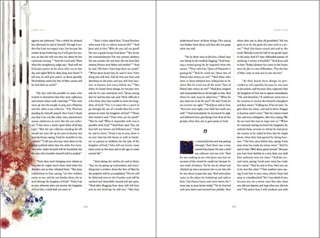
When I first exhibited the Four Holy Gospels at Dillon Gallery in December 2010, one of my favorite images to speak about was the image on Luke 18:4. The image is of five vertical lines, done with sumi ink, and then this “beautiful mess” at the bottom.
Law and Grace
Whenever I read an intense conversation between Jesus and the religious Pharisees (which was quite often!), I wanted to visually convey the tension between law and grace. As I prayed about and mulled over how to do this task, I remembered my Nihonga training as a National Scholar in 1986, when my professors had me draw thousands of lines. It was a tedious act: drawing one line after another, then moving on to copy ancient scrolls by hand. The professors let me try many types of paper, brushes, and sumi ink (slate and slabs that gets rubbed together with water). What I was learning was a hands-on, tacit knowledge of materials. In order to master the Japanese art-making technique of Nihonga, I had to gain this first hand knowledge of working with various materials.
I thought of this discipline as an ideal way to depict the tension between law and grace, and the black and white lines as a way to visually capture the laws of God. I realized it was also a perfect vehicle to depict Jesus, who came to “fulfill the law and not to abolish the law.” (Matthew 5:17) As part of the “line drawing exercise” back then, I learned to pour color pigments into the lines while wet, and to control the “breeding,” a method loosely called the “Tarashikomi technique”. Jesus, in coming to fulfill the law, stayed “within the lines” but poured his divinity (gold) and himself (vermillion, his own sacrifice) into them.
I started the page for Luke 18:4 on the left, drawing black and white lines representative of Jesus’ debate with the Pharisees. But ink accidentally dropped on the upper right corner of the image. I was going to start over, but then I read the bottom portion of the words next to the image. It is a scene when children come to Jesus. The disciples are trying to keep the children away (I imagine them thinking that “this is a serious theological discussion, and kids should stay away!”), and of course, Jesus surprises them once again. “Let the children come to me, and do not hinder then, for to such belongs the kingdom of God.” (Luke 18:15)
The “beautiful mess” on the bottom, done with extravagant minerals, gold and platinum, followed. To paint is to be a child of God, depicting grace that flows out of the Laws of God — boundless, explosive, and playful.
Thank You
I want to thank you for your journey with me into the process and execution of the illumination process of the Four Holy Gospels project. The entire series of original paintings will be an inaugural exhibition at the new Museum of the Bible in Washington, DC, which opened on November 17, 2017. So please stop by!